

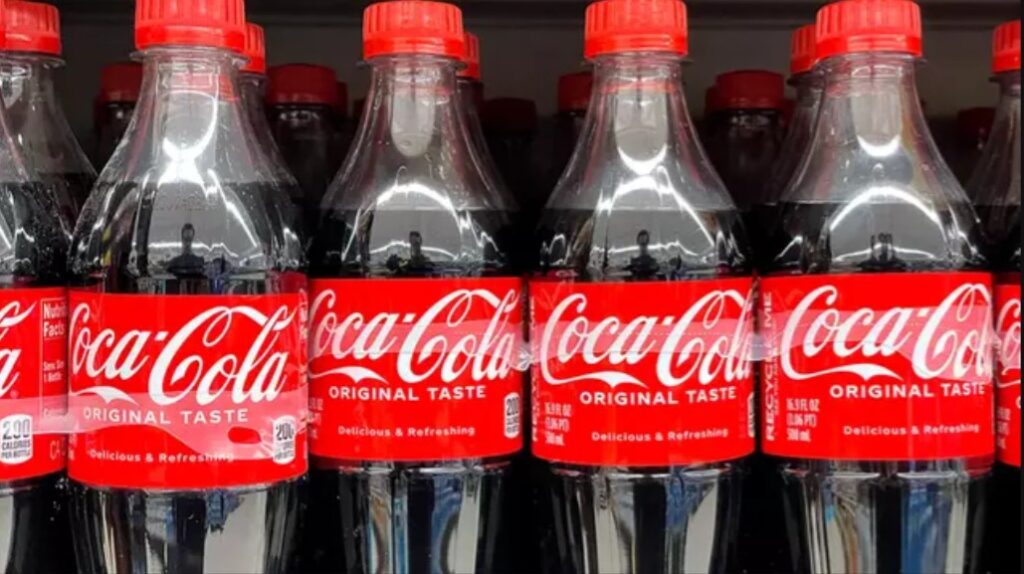
Richard Lau, president of LOGO.com, said: “Businesses cannot overlook the value a great logo holds; they are the connection between a company and potential customers, and what customers will remember most.”
While you may not think much is hidden regarding the rather simple but effective logo of Coca-Cola, Lau has pointed out that the second ‘C’ has somewhat of an unknown meaning.
The extended ‘C’ is believed to symbolise a smile, which ‘subconsciously’ reflects Coca-Cola’s emphasis on happiness and joy.
“This subtle message may go unnoticed, but it subconsciously creates a positive association with the brand in the minds of consumers,” the expert added.
It was back in 1969 when the world-recognised logo was used for the first time, after the brand’s early advertiser, Frank Mason Robinson, suggested the name Coca-Cola.
The logo was presented in a ‘red box, with [Robinson’s] Coca‐Cola script underlined with a white wave, or Dynamic Ribbon Device’, the Mirror notes.
It comes after the Coca-Cola company announced it was changing its iconic recipe.
“As part of its ongoing innovation agenda, this fall in the United States, the company plans to launch an offering made with U.S. cane sugar to expand its Trademark Coca-Cola product range,” a news release from the Coca-Cola Company said.
NBC News reports that Coca-Cola is typically sweetened with corn syrup in the US, while cane sugar (the new recipe) is used in the recipe used in Mexico and many European countries.
While the news was welcomed by some, industry experts have previously said changes in the formula in the Coke specifically sold in the US would involve drastic adjustments to its supply chains.
“Food and beverage industries started to use corn syrup in the U.S. in the past because of costs. It is cheaper than sugar,” Ron Sterk, a senior editor at SOSland Publishing which provides information for the ingredients industry in the States, told Reuters.
However it is made, there’s no doubt that iconic Coca-Cola logo isn’t changing anytime soon.